When going through this process theres a number of things that need to be looked at, these include things such as :
Body language
Decor
Props
Lighting
Costumes
Looking at all these things will help us deconstruct, which is to basically say what you see & connotation, which is what it means, in full detail.
I am going to do this method using two different professional photos of two different bands, the first been You me at six.

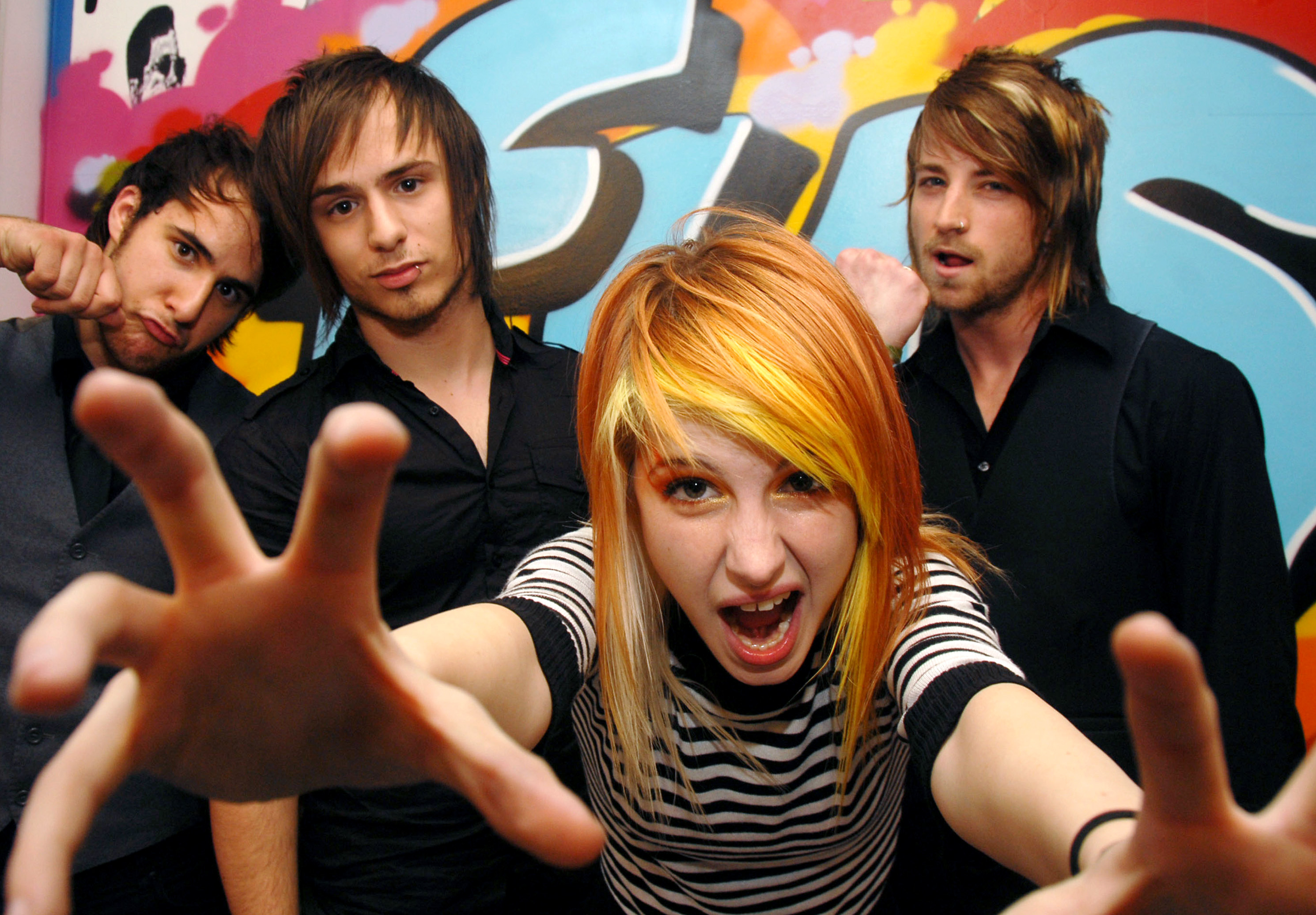
In this photo of you me at six, all the boys have similar body language, they all seem wild, crazy and total party animals. They also look silly with some of the poses that they are using, this suggests that they are all close enough to be themselves around each other, which gives off the feeling of a family like friendship. The focus of the photo, which is the band member closest to the camera, draws you in and makes you feel welcome; he's reaching out to you and showing that he's willing to let anyone in. The photographer has used direct mode of address for all the characters in this photo, which shows that the boys really know how to connect and are willing to get involved, like the action of the hand trying to reach you this also pulls you in. In this photo the boys are all wearing casual clothing which suggests they're not out to impress anyone and they come as they are, this adds a laid back feel, and shows that they are self expressive and free. The lighting is dark in the back ground, but a bright white light is shone on the boys, this makes them stand out and makes them look powerful. It also suggests that like the light they are bright, energetic, and strong it's almost suggesting that they are angels. The other lighting included in the picture is the dance floor and some party lights, which adds to the casual party feel, it makes them seem lively and ready to party. A range of neon colours have also been used to show that the boys are fun and daring, which also adds to the night life effect that they live.
The next artist i have chosen is Haley Williams from the band Paramore.
In this photo of hayley her body language, suggests that she's uncertain and she almost looks like she's creeping about, been sneeky or even gives the feel of a hunter. The photographer has used direct mode of address so that she seems interested in you, which pulls you in, and its almost hard too look away. The surrounding areas are completely blank apart from a pair of black butterfly wings, because they are against a white back ground, they really stand out. The wings make her seem dark, and mysterious, and the colours of her clothes also add to this. The lighting used is very bright, which makes the image seem like she wants to be seen and she wants everyone to notice her, it makes her seem confident. A White back ground has also been used as because her outfit is so dark it makes her stand out, which makes her look powefull, like a preditor she looks sly and independant.

This is my chosen magazine with my chosen artist on the front cover, Hayley williams. The colours that have been chosen give off a rock/emo vibe which is what the magazine is trying to portray. The photo been used is a close up bid shot, and her body language blends in with the magazine and she becomes part of it due to the sign she is pulling with her fingers, this screams rock and roll. Direct mode of address has been used which makes her look involved with the magazine too, and her facial expression suggests a smug look. Other photos of other artists are also on the front screen and they have also been given this rock/emo vibe so that it all fits together, it also helps the audience to feel the theme of the magazine so they know what the magazines about without getting a closer look. This is handy as it pulls you in, and persuades the audience to buy, as it feels personal to the audience who are into the theme of this magazine.