Tuesday, 4 October 2011
Design notes- college magazine
Before i can make my college magazine i need to do some research and planning, to do this i am going to look at already existing college magazines. I need to choose a colour scheme and decide what i will be writing about in my magazine, stories etc. I also need an overall design style.
Here are some past magazines which i have found using Google images.
I've decided to call my magazine, 'Prior Passion Fruit' and i am using a slogan 'One of your five a day', i think this will be a good name as it makes the magazine sound like an everyday essential, that will keep the students on track.
The colour scheme will be neautral, green, yellow, blue and pink, all pastel colours as this fits in with the name of my magazine as been healthy.
this will be the summer, socializing article, as the colours and name also fit in with the summer feeling, and it willl all have a refreshing summer vibe.
Monday, 3 October 2011
Questionnaire
Before starting my music magazine i am going to do a trial college magazine, this is to give me some experience in making a magazine, therefore my music magazine will then be better quality.
Here are some of the questions asked, and the results.
1) Are you a boy or a girl?
Boy ||
Girl ||||||
2)How old are you?
16 ||||||
17 |
18+
3)Are you first or seccond year?
First |||||||
Second
Third+
4)Do you enjoy reading?
Yes ||||
No
Not bothered |||
5)Are you creative?
Yes |||||||
6)Are you confident?
Yes |||||
No ||
7)Do you find it easy making friends?
Yes ||||||
No |
8) Do you eat out at dinner?
Yes ||
No
Sometimes |||||
9)you benefit from information about what's going on in subjects?
Yes ||||||
No |
10)Do you want to know about college events and how you can get involved?
Yes |
No ||||||
11)Do you feel there is enough help offered around college ?
Yes |||||||
No|
12)When buying clothes do you always buy from the same brand?
Yes
No |||||||
13) Are you a workaholic?
Yes
No |||||||
14)Do you buy fake designer items(bags and watches) or are they real makes?
Fake |
Real
Micture |||||||
15) Do you have a part time job?
Yes |
No
Looking ||||||
16)Are you religious?
Yes
No |||||||
17) Do you do things that will benefit the environment? (like recycle)
Yes |
No |
Sometimes |||||||
18)Do you prefer been with friends or family?
Friends
family |
both ||||||
19)Do you enjoy music?
Yes |||||||
No
Occasionaly
20) Are you a party animal?
yes
no
at weekends |||||||
21) Does socializing appeal to you?
Yes ||||||
No |
22) What information would benefit you about university?
What courses are offered where |
Course Fee's
local universitys
All of the above ||||||
The Questions i used explored a number of different theories, The chosen questions helped me to understand what the audience would be wanting out of my magazine, by also asking them personal questions i can get a view of my audience personalities. I included some questions to find out about the charactoristics of my audience. I also used Maslow's Hierarchy of needs to determine what my readers will benefit from getting from my magazine, i also involved some to find out about social grades, to find out more about my readers background, class and status. Physcographs were also used to achieve an overall personality of my readers.
Thursday, 22 September 2011
Deconstruction and connotation
When going through this process theres a number of things that need to be looked at, these include things such as :
Body language
Decor
Props
Lighting
Costumes
Looking at all these things will help us deconstruct, which is to basically say what you see & connotation, which is what it means, in full detail.
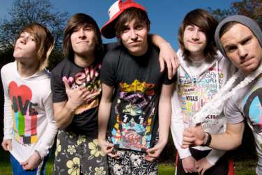
I am going to do this method using two different professional photos of two different bands, the first been You me at six.
In this photo of you me at six, all the boys have similar body language, they all seem wild, crazy and total party animals. They also look silly with some of the poses that they are using, this suggests that they are all close enough to be themselves around each other, which gives off the feeling of a family like friendship. The focus of the photo, which is the band member closest to the camera, draws you in and makes you feel welcome; he's reaching out to you and showing that he's willing to let anyone in. The photographer has used direct mode of address for all the characters in this photo, which shows that the boys really know how to connect and are willing to get involved, like the action of the hand trying to reach you this also pulls you in. In this photo the boys are all wearing casual clothing which suggests they're not out to impress anyone and they come as they are, this adds a laid back feel, and shows that they are self expressive and free. The lighting is dark in the back ground, but a bright white light is shone on the boys, this makes them stand out and makes them look powerful. It also suggests that like the light they are bright, energetic, and strong it's almost suggesting that they are angels. The other lighting included in the picture is the dance floor and some party lights, which adds to the casual party feel, it makes them seem lively and ready to party. A range of neon colours have also been used to show that the boys are fun and daring, which also adds to the night life effect that they live.
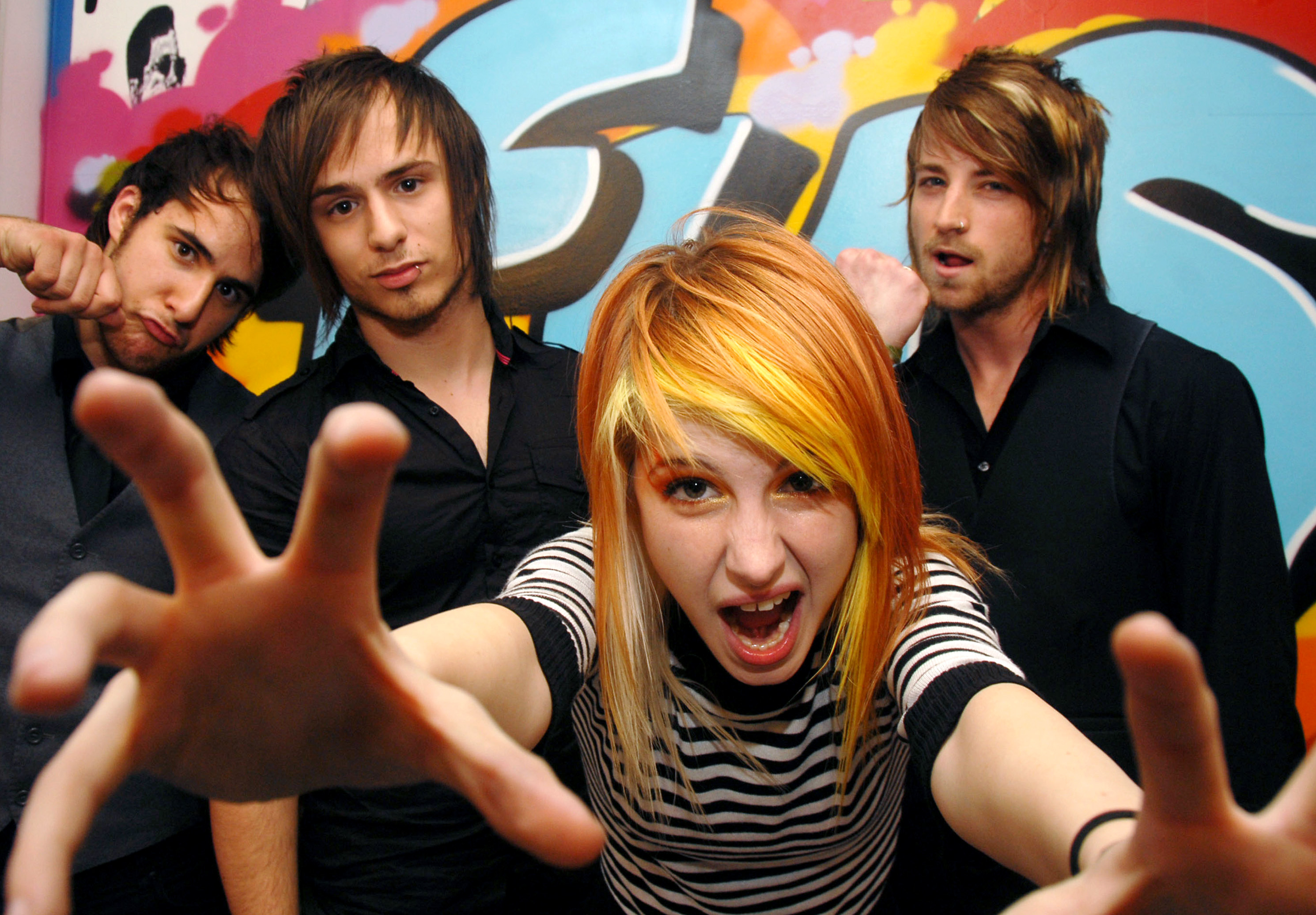
The next artist i have chosen is Haley Williams from the band Paramore.
In this photo of hayley her body language, suggests that she's uncertain and she almost looks like she's creeping about, been sneeky or even gives the feel of a hunter. The photographer has used direct mode of address so that she seems interested in you, which pulls you in, and its almost hard too look away. The surrounding areas are completely blank apart from a pair of black butterfly wings, because they are against a white back ground, they really stand out. The wings make her seem dark, and mysterious, and the colours of her clothes also add to this. The lighting used is very bright, which makes the image seem like she wants to be seen and she wants everyone to notice her, it makes her seem confident. A White back ground has also been used as because her outfit is so dark it makes her stand out, which makes her look powefull, like a preditor she looks sly and independant.
This is my chosen magazine with my chosen artist on the front cover, Hayley williams. The colours that have been chosen give off a rock/emo vibe which is what the magazine is trying to portray. The photo been used is a close up bid shot, and her body language blends in with the magazine and she becomes part of it due to the sign she is pulling with her fingers, this screams rock and roll. Direct mode of address has been used which makes her look involved with the magazine too, and her facial expression suggests a smug look. Other photos of other artists are also on the front screen and they have also been given this rock/emo vibe so that it all fits together, it also helps the audience to feel the theme of the magazine so they know what the magazines about without getting a closer look. This is handy as it pulls you in, and persuades the audience to buy, as it feels personal to the audience who are into the theme of this magazine.
Tuesday, 20 September 2011
Photo shoot with keiran Froom and will Walters
Above and below, a medium close up of two people, where their clothes stand out against a background. We chose to take these pictures against the brick wall, and the clothes been worn were dark and made the brick work look delicate.
This shot was careful use of framing. We chose the trees to frame the picture as they surround the main focus in a controlled way.
We used a rose as our interesting texture as it is built up if layers and shades, and the grass behind adds to the texture of the rose.
This was a low angled shot, we were stood on a wall while the photographer was stood on the floor so we could get a good quality low angled shot.
This was another shot for careful use of framing.
This was a shot we took as an interesting textured back ground, it has a creepy and haunted feel to it.
This was a photo which we used to demonstrate the rule of thirds.
This was another low angled mid shot. below and above.
This shot was careful use of framing. We chose the trees to frame the picture as they surround the main focus in a controlled way.
We used a rose as our interesting texture as it is built up if layers and shades, and the grass behind adds to the texture of the rose.
This was a low angled shot, we were stood on a wall while the photographer was stood on the floor so we could get a good quality low angled shot.
This was another shot for careful use of framing.
This was a shot we took as an interesting textured back ground, it has a creepy and haunted feel to it.
This was a photo which we used to demonstrate the rule of thirds.
This photo demonstrates juxtaposition, we took a delicate and beautiful rose and put it with a rough and worn wall.
This was another low angled mid shot. below and above.
Thursday, 15 September 2011
Magazine research: past magazines & articles
 To help me focus on the layout of my magazine i have been looking at past magazines, the reason for this is so i can understand the way kerrang set out their mgazines, that way when i come to creating my own in will look as professional as possible. Here are some examples i found when doing my research, and what i thought about some of them.
Here is an image of a past article, this will help me determine how the layout of my articles will be. As you can see an image has been included, this is a good idea as the person reading the magazine will be more likely to read the article if it is broken down with pictures, especially if those pictures are of someone they are insterested in.
Magazine research; working on the overall look: artists.
I've been doing some research on past Kerrang magazines, to see the sort of artists they work with, this should hopefully give me some inspiration when choosing the artists that will be included in my issue. I've found some pictures using google of some of the artists that i am thinking about including in my magazine, i need to consider the style and setting of the pictures so that they all have a similar theme, this will make sure that the magazine all blends together, and looks like its all part of the same issue. After looking through the photos i am planning on doing an issue that focuses on bands rather than solo artists, leaning towards the Scene and Emo stereotype more than any other, the genre of music i will mostly use in my magazine will be alternative rock.


Subscribe to:
Comments (Atom)


